- by Ahmed Shareek
What Sapphire Color Looks Best for Your Skin Tone? A Practical Guide
- by Ahmed Shareek

New to buying sapphires? Start with our Ultimate Sapphire Buying Guide — the complete resource for colour, origin, treatment, and pricing.

The question of which sapphire color looks best against a specific skin tone is one of the most personal and most practical questions in colored gemstone buying. It matters because a gemstone ring is worn against the hand every day — in every light, in every context, in constant proximity to the skin. A stone that clashes with your skin tone does not look right regardless of its quality; a stone that harmonizes with it looks better than its price point alone would suggest.
The standard advice — cool stones for cool skin, warm stones for warm skin — is a useful starting point but significantly oversimplified. The actual interaction between sapphire color, skin tone, and setting metal is more nuanced, and the most useful guidance is more specific than a simple warm-cool matching rule. This guide provides that specificity, working through the main skin tone categories and the sapphire colors that interact with each most effectively.
One important qualification before starting: these are guidelines, not rules. Personal preference, cultural context, and the specific aesthetic you are building for your ring all legitimately override any general recommendation. Use this guide as a starting framework, not a constraint.
Skin tone advice works best when it distinguishes between two different things that are often conflated: depth (how light or dark the skin is) and undertone (the underlying hue that shows through the surface).
Depth runs from very fair through light, medium, olive, and tan to deep and very deep. Undertone is the underlying hue — cool (pink, red, or bluish), warm (yellow, peachy, or golden), or neutral (a balance of both).
To identify your undertone: look at the veins on the inside of your wrist in natural daylight. Blue or purple veins suggest a cool undertone. Green veins suggest a warm undertone. Blue-green veins suggest neutral. Alternatively, notice whether silver or gold jewelry tends to flatter you more — silver suits cool undertones; gold suits warm; both suit neutral.
Skin Tone Spectrum
Fair
Cool
Fair
Warm
Medium
Olive
Tan
Brown
Deep
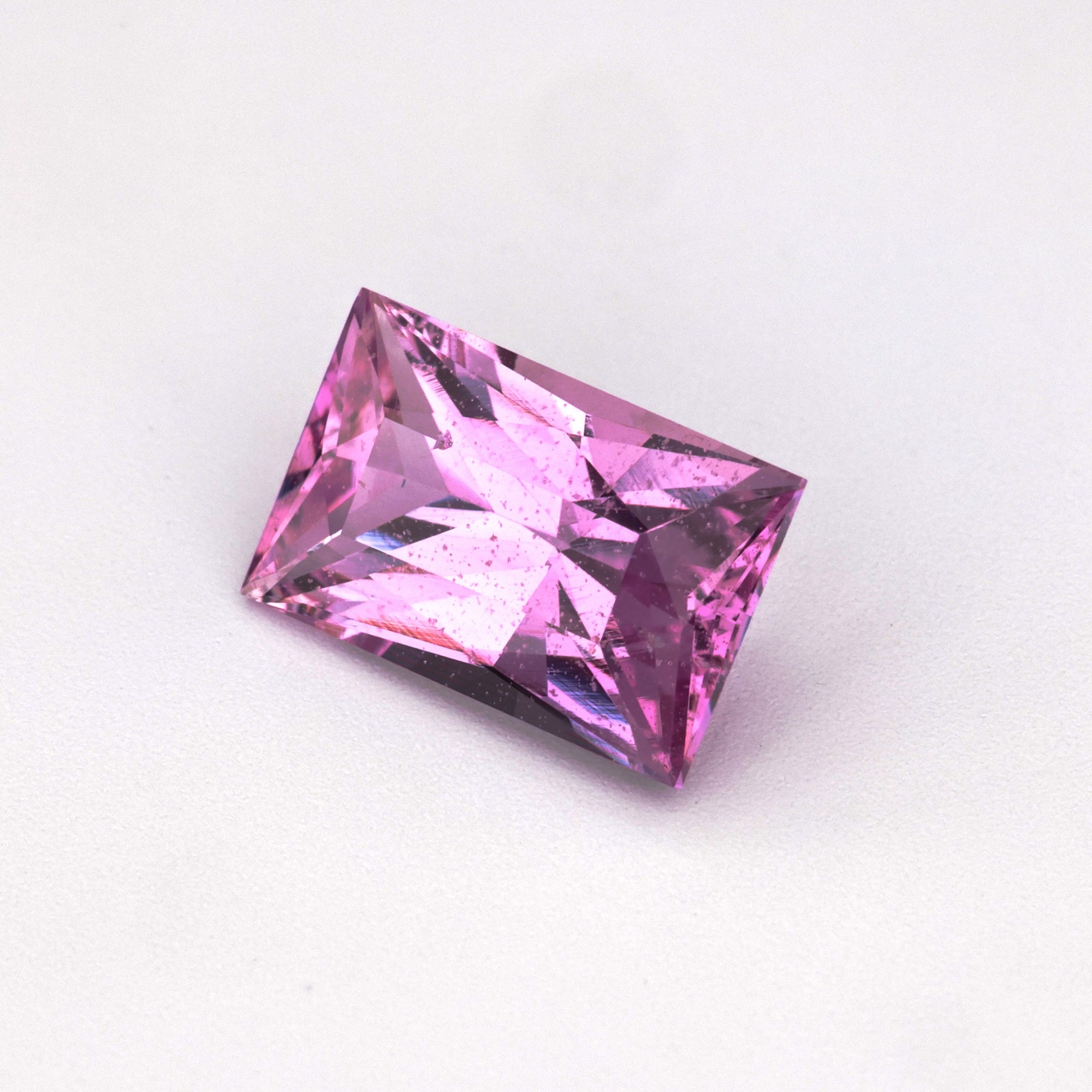
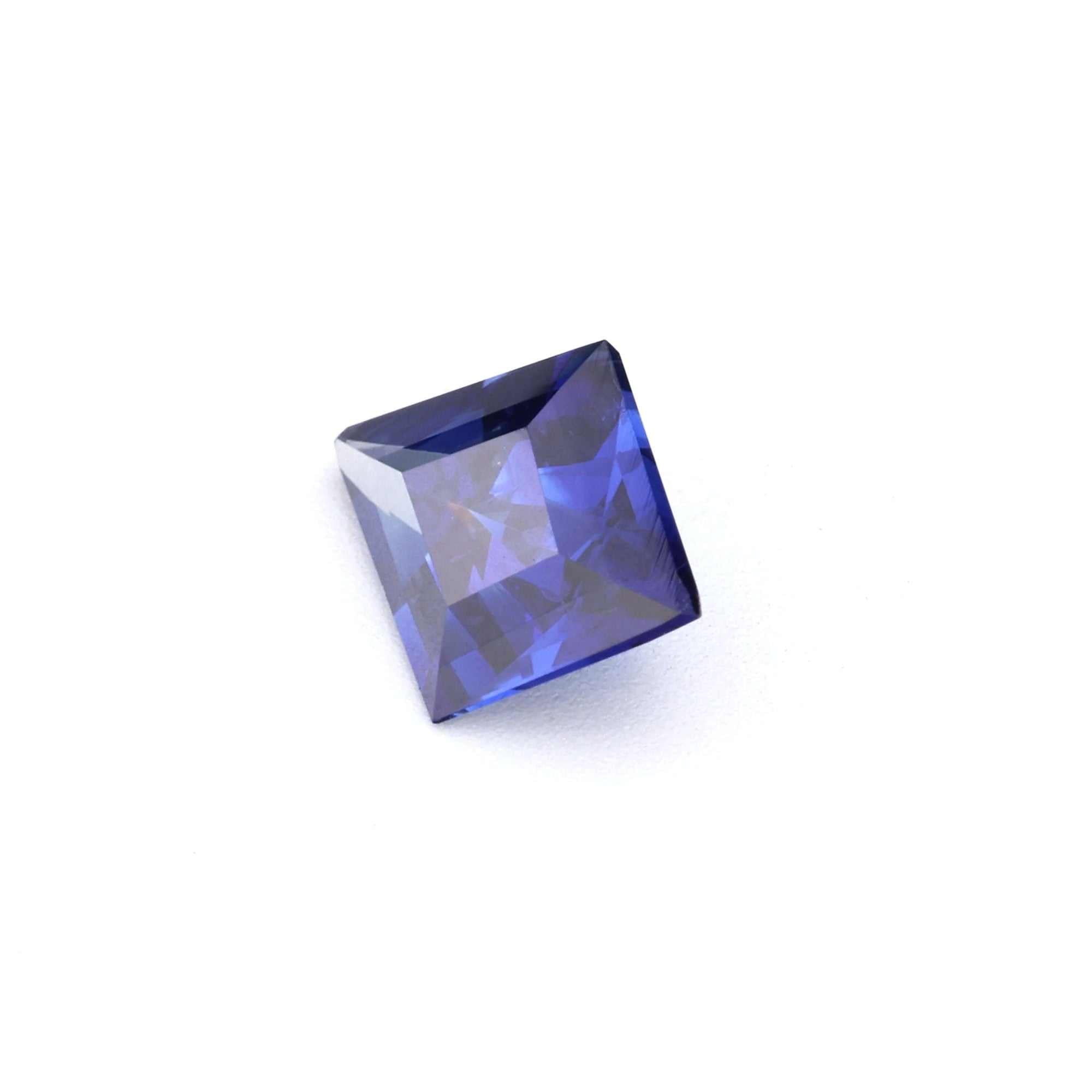
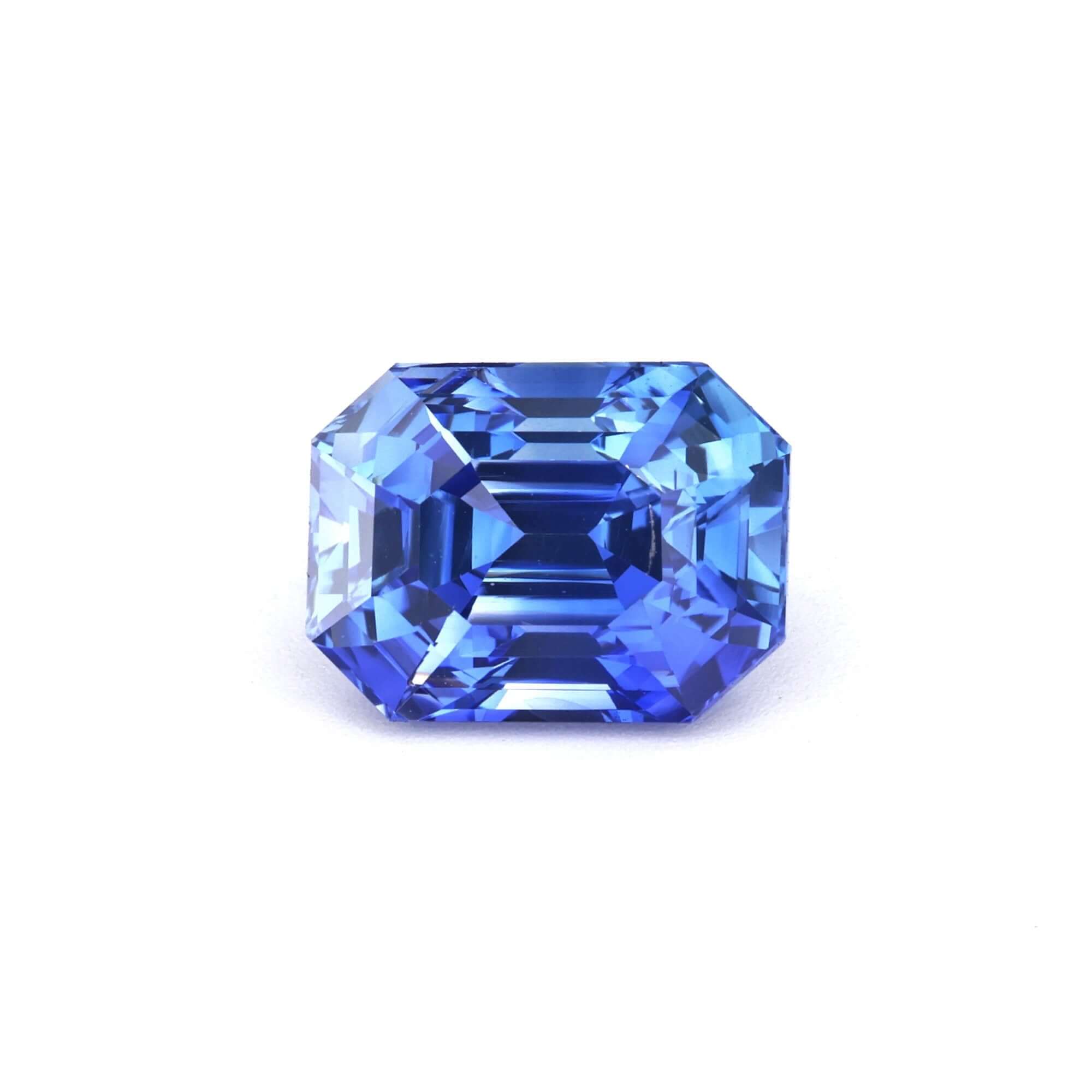
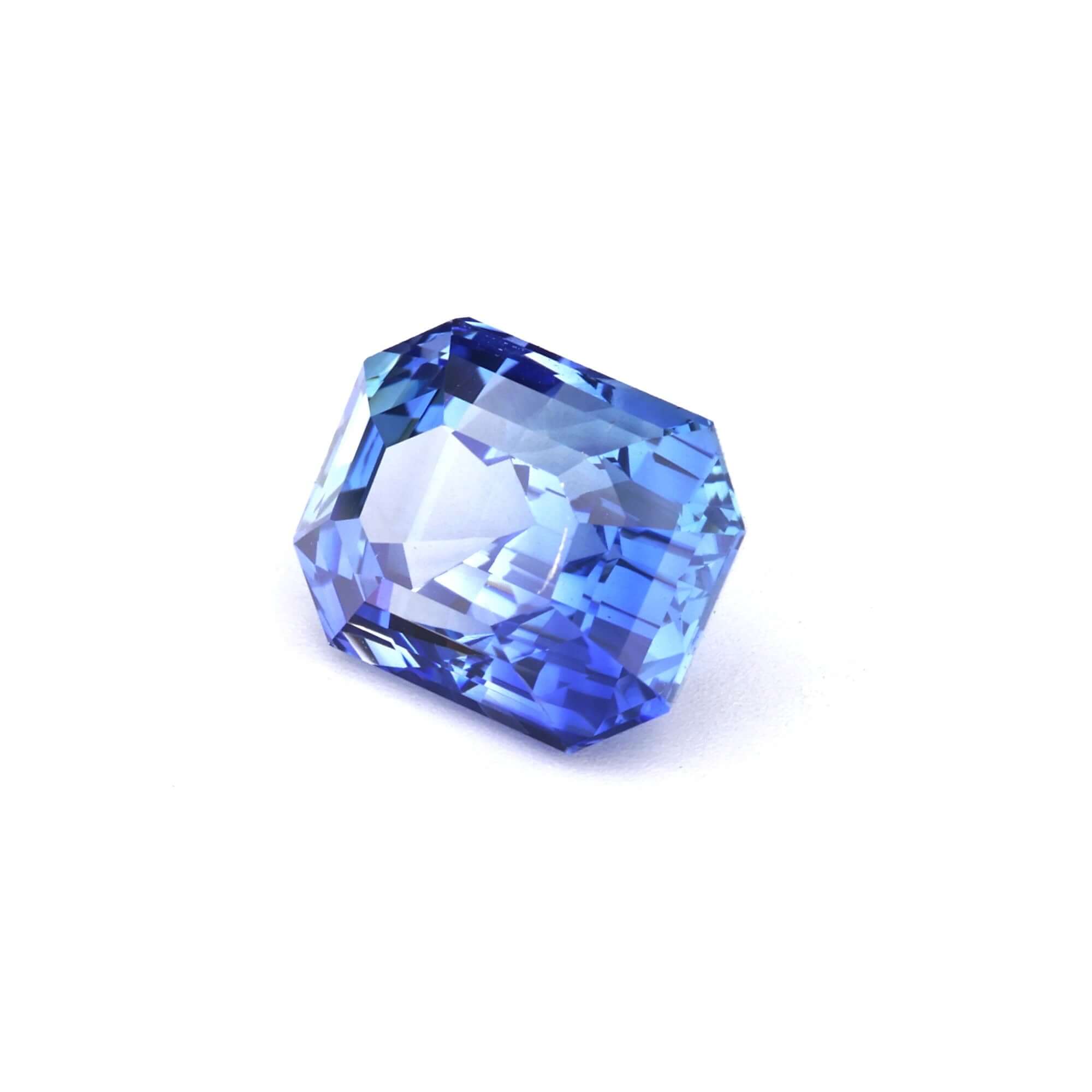
Fair to light skin with cool (pink or rosy) undertones is the skin type most associated with traditional blue sapphire engagement rings — and the association has genuine optical logic behind it. Cool-toned fair skin and vivid blue sapphire create a harmonious cool palette where both the stone and the skin share the same undertone family. The blue does not compete with the skin; it complements it.


White gold and platinum are the most natural partners for cool-toned fair skin. Yellow gold can work beautifully as a deliberate contrast — the warm metal against cool skin and stone — but requires a more confident aesthetic choice.
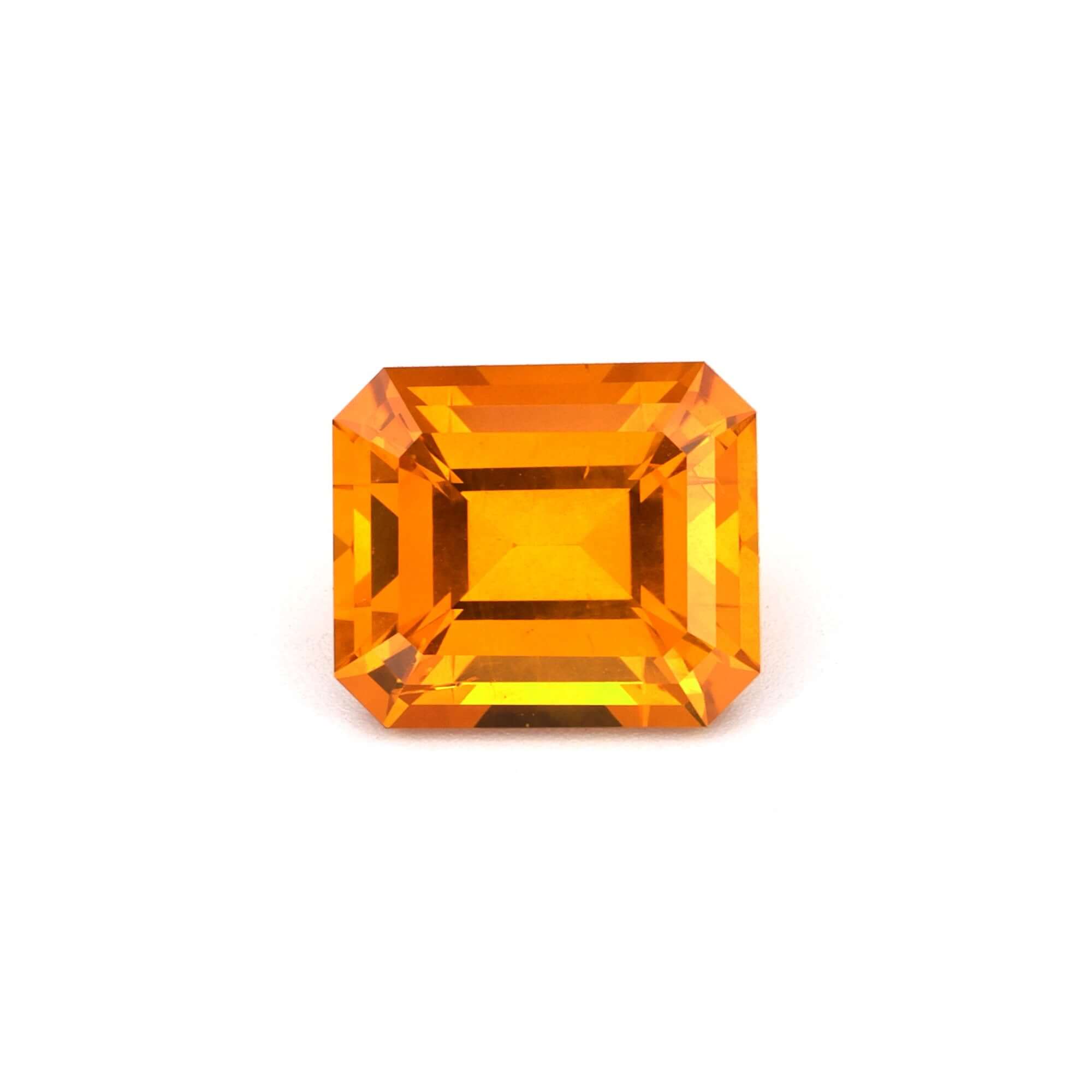
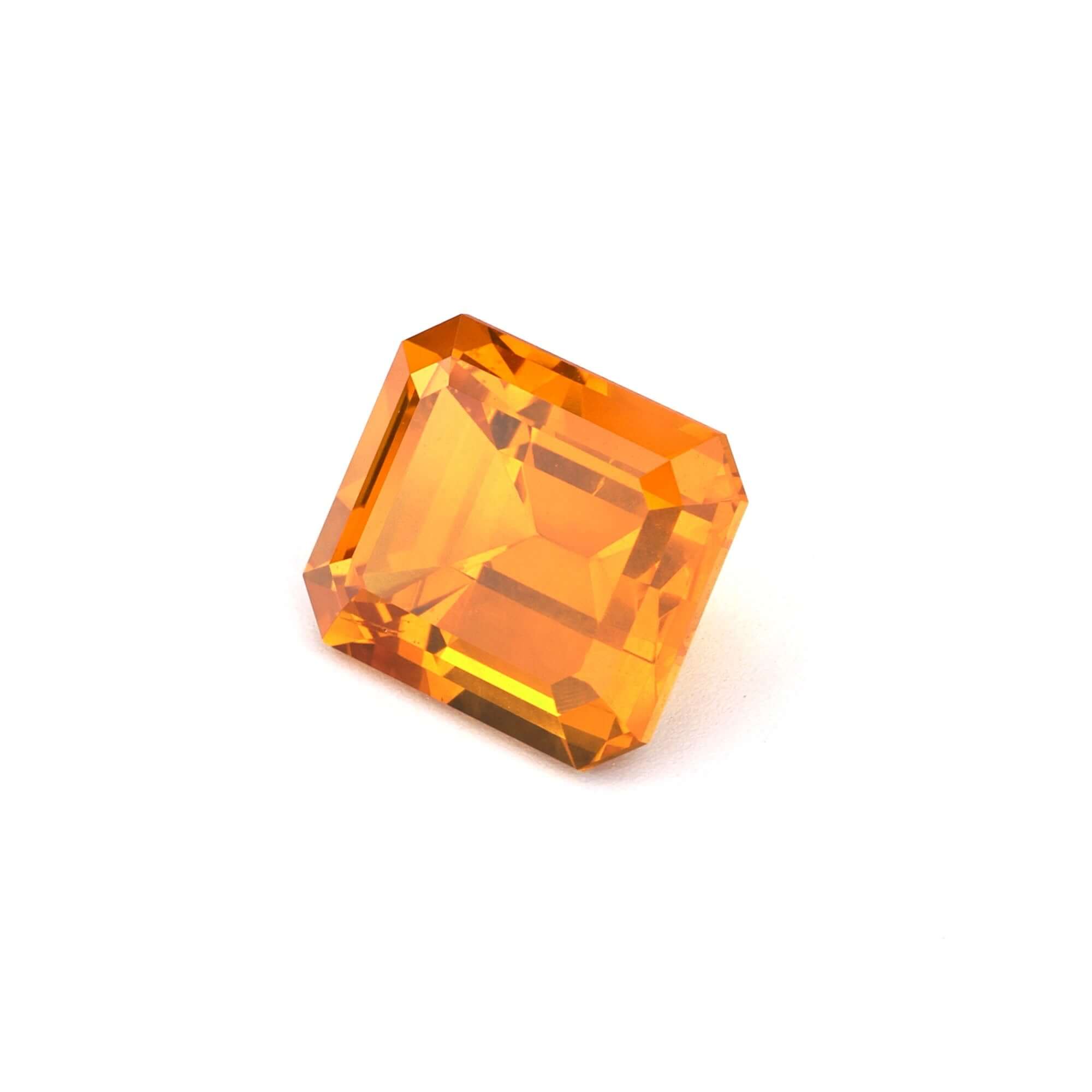
Very vivid orange and strong yellow can clash with cool-toned fair skin, as the warm hues compete with rather than complement the skin's cool cast. These colors can still work beautifully, but they require more attention to the specific hue and saturation to avoid looking jarring against the hand.
Fair to light skin with warm (golden or peachy) undertones presents a different palette entirely. Warm-toned fair skin looks best with gemstone colors that echo or complement its warmth rather than the cool colors that suit cool-toned equivalents.


Yellow gold and rose gold are the most natural partners for warm fair skin. Rose gold in particular with peach or padparadscha sapphire on warm fair skin is one of the most cohesive and flattering ring combinations in the market.
Pure cool blue and violet can look slightly disconnected from warm fair skin. The effect depends on saturation: a very vivid blue is striking enough to transcend the undertone mismatch; a softer blue looks more washed out against warm skin than against cool.
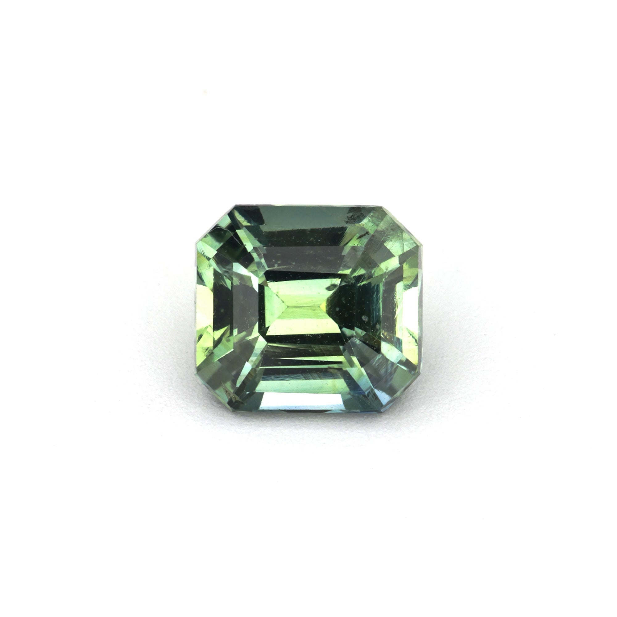
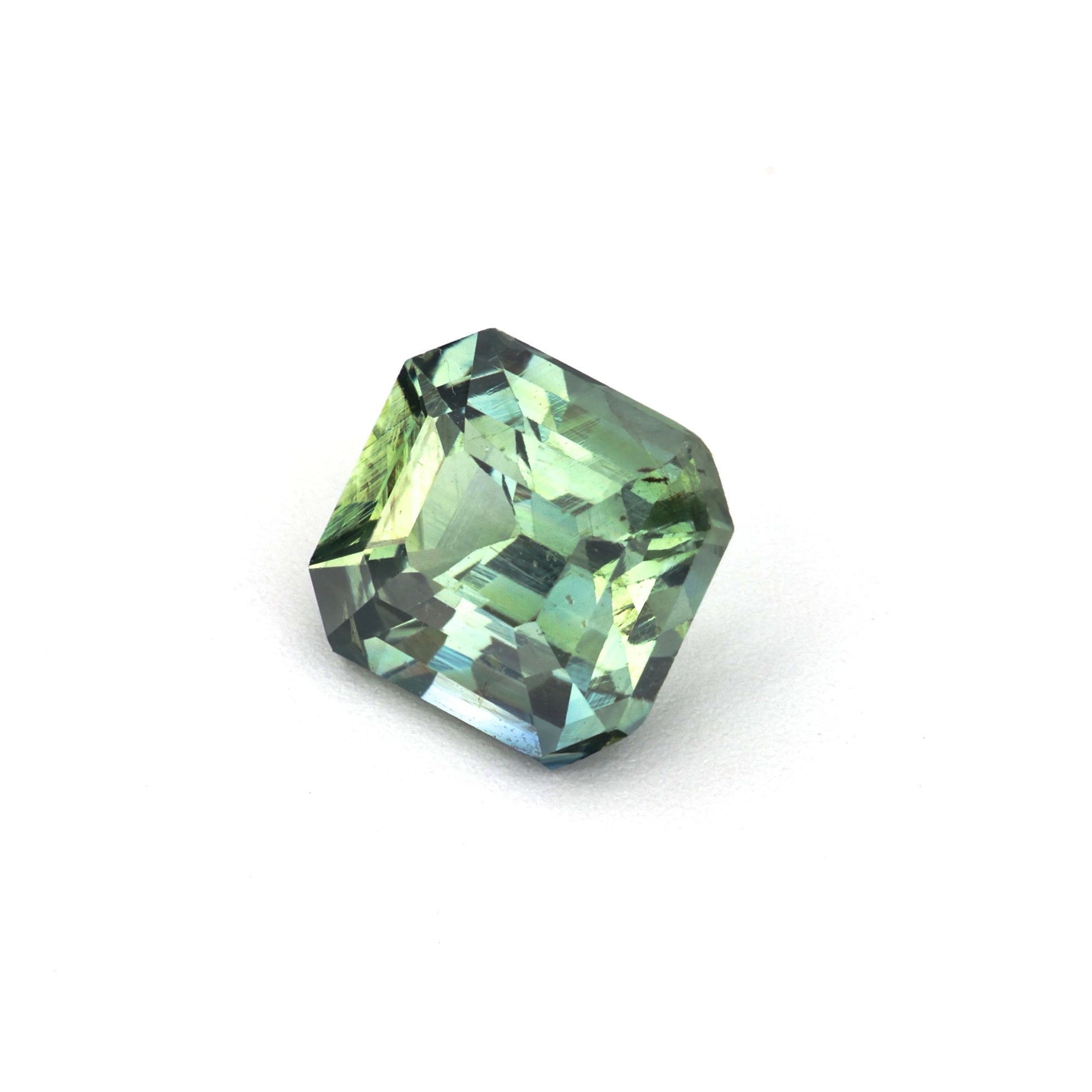
Medium and olive skin tones have the most flexibility of any skin type: the medium depth provides enough contrast for most sapphire colors to read clearly, and the olive warmth harmonizes with warm colors while being distinct enough from cool colors to create attractive contrast.

Olive and medium skin tones are the most metal-flexible of all skin types. Yellow gold, rose gold, and white gold all work well, each creating a different aesthetic. Yellow gold and olive skin with a yellow sapphire is a warm, unified palette. White gold with a deep blue on olive skin is a cool, striking contrast. Rose gold with peach or padparadscha on warm olive skin is romantic and cohesive.
Tan and brown skin provides excellent contrast for vivid, saturated sapphire colors. The depth of the skin allows rich, saturated colors to read at their most dramatic without either overwhelming the stone or being overwhelmed by it.

Yellow gold is the most natural partner for warm brown skin — the warm metal unifies the palette. Rose gold reads as warmly romantic. White gold creates maximum contrast, which works particularly well with vivid blue or teal where the contrast effect is the design statement.
For tan and brown skin, saturation matters more than for lighter skin types. A pale or pastel sapphire can look washed out against the richness of warm brown skin; a vivid, richly saturated stone looks proportionally more impressive.
Deep skin provides the richest and most dramatic backdrop for sapphire colors. The depth and warmth of deep skin makes vivid, saturated colors look extraordinary, and the contrast between stone and skin at this depth level is visually powerful for almost any sapphire color.

Yellow gold on deep skin is a classic, coherent, warm combination. White gold creates maximum contrast, which suits the high-contrast aesthetic that vivid colors on deep skin naturally produce. Rose gold reads as a warm, romantic choice that sits between the extremes.
Deep skin provides sufficient contrast for virtually any sapphire color to read beautifully. The choice comes down to whether you want to harmonize (warm tones with warm skin) or contrast (cool vivid blue or teal against warm deep skin). Both strategies produce genuinely beautiful results — the decision is about the aesthetic character you want the ring to have.
The interaction between sapphire color and skin tone is significantly mediated by the setting metal. The metal is the visual bridge between stone and skin, and changing the metal can make the same stone read completely differently against the same hand.
The guidelines above are grounded in color theory and real aesthetic observation, but they are not prescriptions. Several factors legitimately override them:
Personal preference: If you love vivid blue sapphire and have warm golden skin, wear vivid blue sapphire. The guidelines describe what tends to be most harmonious — they do not describe what is right for a specific person with specific aesthetic preferences.
Contrast as a deliberate aesthetic: Some of the most striking rings are deliberately high-contrast — a cool stone against warm skin, a warm stone against cool skin — because the contrast itself is the design statement.
Cultural and symbolic significance: If a specific sapphire color carries personal, cultural, or Jyotish significance, that significance legitimately overrides aesthetic skin-tone matching.
The stone itself: A specific stone at a specific quality level may simply be so beautiful that it transcends the guidelines. If a stone makes you feel something when you look at it — in any color — that feeling is real data about the right stone for you.
The most reliable way to know which sapphire color looks best on your specific skin is to see the stone against your hand in natural light. Our Try-On program ships select loose stones to you for home evaluation before you commit — so you can hold the stone against your skin in your own lighting and make the decision with your own eyes rather than working from a photograph.
Browse the full collection by color — blue, teal, yellow, pink, peach, purple, orange, green — or email crescentgems@gmail.com with your skin tone description and setting preferences and we will put together specific recommendations from our current inventory. We respond personally within one business day.
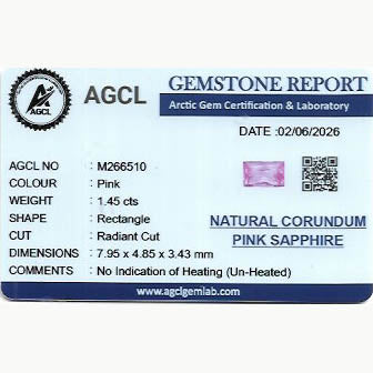
| Skin Tone | Undertone | Strongest Matches | Best Metal |
|---|---|---|---|
| Fair / Light | Cool (pink/rosy) | Blue, teal, violet, pale pink | White gold, platinum |
| Fair / Light | Warm (golden/peachy) | Yellow, peach, padparadscha, warm blue | Yellow gold, rose gold |
| Medium / Olive | Warm to neutral | Deep blue, teal, yellow, pink, padparadscha, purple | All metals — most flexible |
| Tan / Brown | Warm | Vivid blue, teal, pink, yellow, orange, purple | Yellow gold, rose gold |
| Deep | Warm | Any vivid color — blue, teal, pink, green, yellow, orange | Yellow gold, white gold |
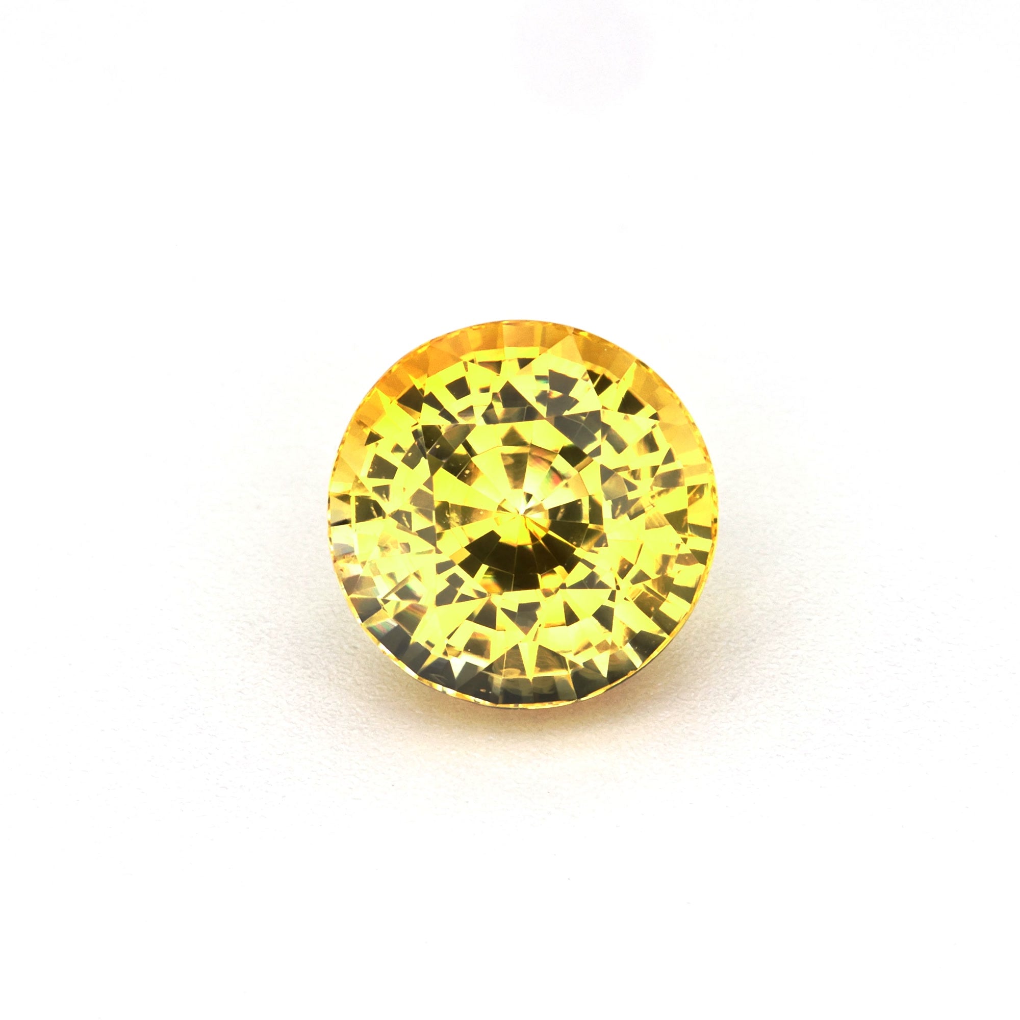
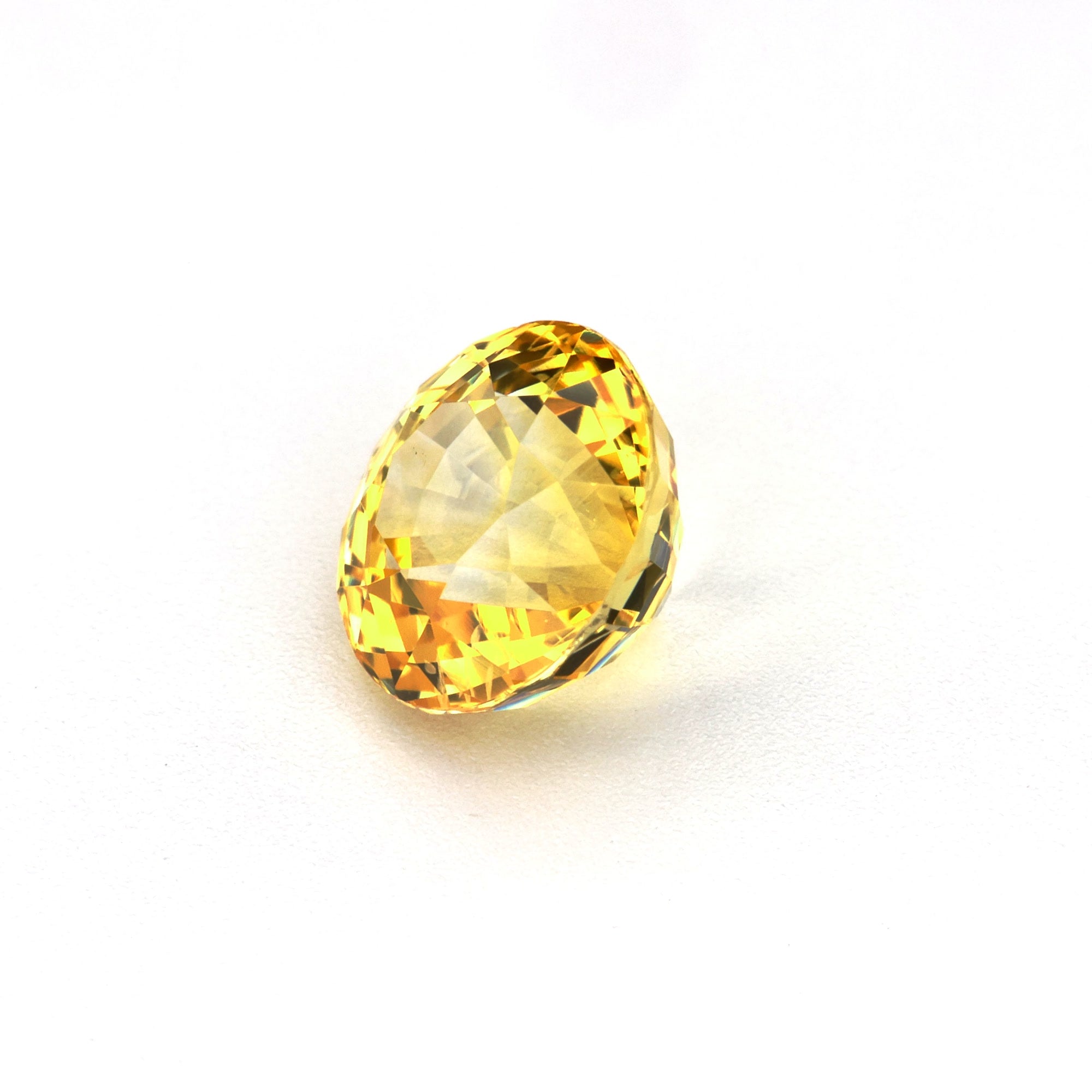
CG8451
1.50 ct Natural Heated Yellow Sapphire – Step-Cut Round
CG8448
CG8449
CG8447
CG8446
CG8444
CG8443
CG8442
CG8445
CG8433


The Ultimate Guide to Buying Natural Loose Sapphires
The definitive guide to buying a natural loose sapphire: colour, origin, treatment, cut, shape, certification, pricing, and engagement rings, with links to every Crescent Gems guide and collection.
Read moreabout The Ultimate Guide to Buying Natural Loose Sapphires

Custom Sapphire Rings — The Complete Guide to Designing Your Own
Read moreabout Custom Sapphire Rings — The Complete Guide to Designing Your Own


Cost of a 2 Carat Sapphire — Pricing, Scarcity, What Your Budget Buys
Read moreabout Cost of a 2 Carat Sapphire — Pricing, Scarcity, What Your Budget Buys

Cost of 1 carat Sapphire — Honest Pricing